Neofiliac July 2020 Update: Enhanced Search, External Reviews, Design Updates, & Enriched Comments
Neofiliac's July 2020 update brings new features and enhancements that improve the user experience and interactivity. They contribute to building Neofiliac as the open, independent space for consumers to follow, study, and compare new products objectively and for businesses to interact with their audiences.
Enhanced Search
With the July 2020 update, Neofiliac has moved away from direct database searches. Instead, an elasticsearch-based search is integrated to the backend. This change allows us to conduct searches and enable filtering in more fields with no perceivable performance penalty. It also offers better search results for the English language.
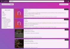
More importantly, multi-index search means that users can now search Articles, Companies, and Products together, with results ranked using the same criteria.

A single search across Articles, Companies, and Products, ranked together thanks to Multi-Index Search
Users can easily refine the search results and reorder them based on their needs.
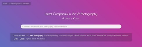
For your convenience, we have also added search fields on the index pages of Articles, Companies, and Products as well as industry pages. Unlike the main search bar in the header, these fields allow you to constrain your searches in articles, companies, or products directly (within the industry that you are browsing if applicable).

Search on Article, Company, and Product pages takes you directly to article, company, or product search results
External Reviews
The July 2020 update also brings external reviews to product pages. Quality external reviews are selected and presented to Neofiliac users in one place, between the Q&A section and the Comment section.

External Reviews is a new section for product listings
In selecting quality reviews, we rule out hype videos, paid promotions, meaningless "unboxing", and low-quality presentations. The goal is to provide more third-party information for consumers to form their own opinion—a goal that is central to Neofiliac.
Design Updates
A number of design improvements have come with the July 2020 update. For example, links in the header have been removed in favor of a Menu-First approach. The space left open are now occupied by a Search Bar. In the past, users had to click on the Search Toggle to expand the Search Bar. The new approach helps users leverage our enhanced search functionality.

A Menu-First approach frees up the header for a new search bar
Buttons on Neofiliac now also feature fully-rounded corners. This subtle change helps users visually distinguish them from contents, which are presented in rectangle cards, on a subconscious level. The result is smoother and faster navigation.
The breadcrumb section on each page now also feature an elegant transparent background that improves their readability. Again, this improvement aims at creating a smoother user experience.
Expanded galleries, which can be found in article and product listings, now can also be closed with the back button. This is useful if, for example, users browse Neofiliac using Android: a single press on the back button closes the gallery.
In the same spirit, photos in the main texts of articles can now be clicked on: the Article Gallery will automatically expand. This allows users to view each image in detail when needed.
Last but not least, when product feature lists or the product descriptions are too long, they are now collapsed at launch. Users can easily expand or collapse them when needed. This compacts information and helps users navigate more quickly.
Article Gallery

